Just what does it mean to say, 'sea ice extent' anyway? The answer to that question reveals why it is so difficult to model the ice extent. The accepted standard for sea ice extent is the area of the ocean that has at least 15% ice cover. Let's do some math and you can see the problem.
Suppose we have, just for example, 1000 square kilometers of 100% ice coverage. If 25% of that ice melts, we now have 1000 square kilometers of 75% ice coverage. Under the 15% rule, they are the same. Now, let's suppose the wind and currents break this up and expands that ice into an area of 1500 square miles. This area will now have an average ice cover of 50%. Under the 15% rule, we have seen an increase in ice extent of 50% even though we have 25% less ice.
The reverse is also true. If we had started with the 1500 square kilometers of 50% coverage, wind and currents could compress this ice into an area of 1000 square kilometers and 75% coverage. This is a reduction in sea ice extent, even though we have the same amount of ice.
The bigger question is, how does this fit in the long-term trend and that is very revealing.
Here is the sea ice trend for March (through 2014), the normal month of maximum extent:
 |
| Source: NSIDC |
Let's compare a few other graphics.
This is a plot of the winter Arctic sea ice extent (including the maximum extent) for the years of 1980 through 1989. The dark solid line in the middle is the 1981 - 2010 average. Almost every year was above the average line for the entire period plotted.:
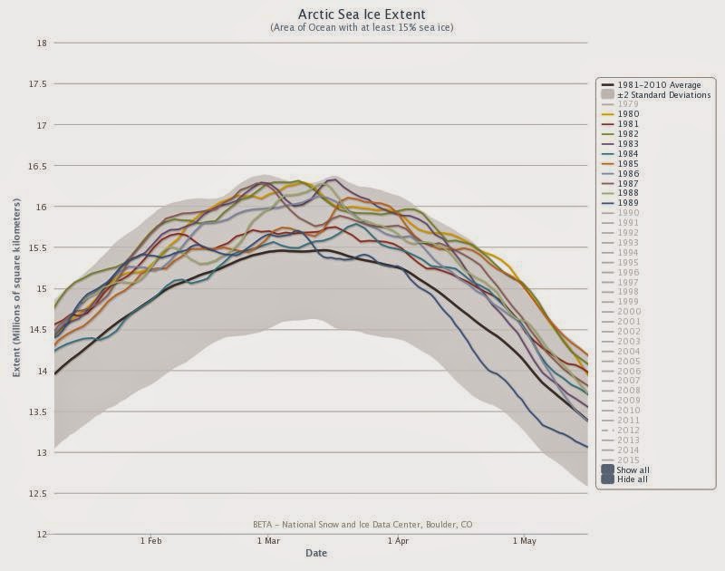 |
| Source: NSIDC |
This is the same plot for the years of 1990 through 1999. Now we see several years plotting below the average line.:
 |
| Source: NSIDC |
Now, compare to this plot showing the years of 2006 through 2015 (the incomplete line on the bottom). Now, the extent plots below the average for almost all points.:
 |
| Source: NSIDC |
When you compare these three plots you can see that the extent is decreasing rapidly. Not only that, we can see there were places that routinely had ice cover in 1980 that have not seen ice for decades.
Now, that statement about this being the minimum maximum means something.
And, keep in mind this is what is happening in the dark of the winter. There can be no mistaken belief it is caused by some reduction in sunlight. There is only one possible explanation - the Arctic Region is getting warmer, even in the winter time. Some combination of warmer air and warmer seas is keeping the ice from forming the way it used to.
By the way, in the same vein, I read an article describing how the snow in Wyoming is melting earlier every year and is now melting 16 days earlier than it was in the 1970s.
Coincidence?
No comments:
Post a Comment